Let\’s delve into the nuances of adaptive and responsive design, exploring their definitions, key differences, benefits, and considerations to help choose the right approach for mobile UX.
𝐔𝐧𝐝𝐞𝐫𝐬𝐭𝐚𝐧𝐝𝐢𝐧𝐠 𝐀𝐝𝐚𝐩𝐭𝐢𝐯𝐞 𝐃𝐞𝐬𝐢𝐠𝐧:
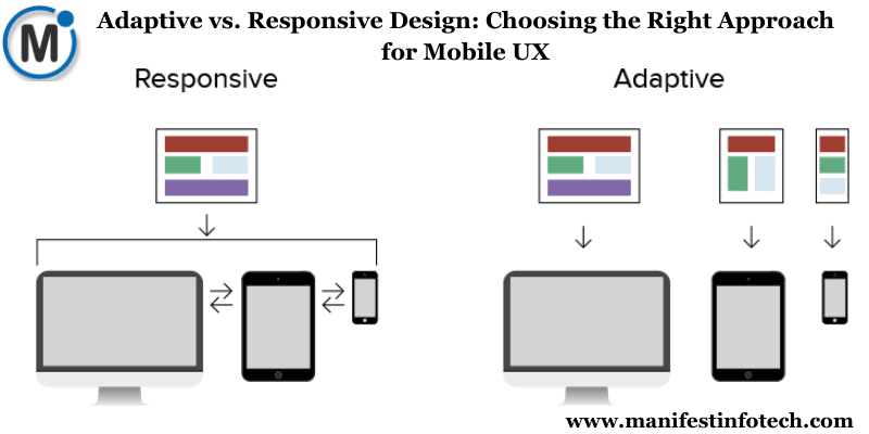
𝐓𝐚𝐢𝐥𝐨𝐫𝐞𝐝 𝐒𝐨𝐥𝐮𝐭𝐢𝐨𝐧𝐬 𝐟𝐨𝐫 𝐒𝐩𝐞𝐜𝐢𝐟𝐢𝐜 𝐃𝐞𝐯𝐢𝐜𝐞𝐬: Adaptive design involves creating multiple layouts specifically targeted at different devices or screen sizes, offering a customized experience for each device category.
𝐃𝐞𝐯𝐢𝐜𝐞 𝐃𝐞𝐭𝐞𝐜𝐭𝐢𝐨𝐧 𝐚𝐧𝐝 𝐓𝐚𝐫𝐠𝐞𝐭𝐞𝐝 𝐓𝐞𝐦𝐩𝐥𝐚𝐭𝐞𝐬: Through device detection, adaptive design serves predefined layouts designed explicitly for particular device types, providing optimized experiences.
𝐏𝐫𝐨𝐬 𝐚𝐧𝐝 𝐂𝐨𝐧𝐬 𝐨𝐟 𝐀𝐝𝐚𝐩𝐭𝐢𝐯𝐞 𝐃𝐞𝐬𝐢𝐠𝐧:
𝐀𝐝𝐯𝐚𝐧𝐭𝐚𝐠𝐞𝐬: Precise control over the user experience for specific devices, potentially faster load times.
𝐃𝐢𝐬𝐚𝐝𝐯𝐚𝐧𝐭𝐚𝐠𝐞𝐬: Higher development costs and increased maintenance for multiple layouts.
𝐔𝐧𝐩𝐚𝐜𝐤𝐢𝐧𝐠 𝐑𝐞𝐬𝐩𝐨𝐧𝐬𝐢𝐯𝐞 𝐃𝐞𝐬𝐢𝐠𝐧:
𝐅𝐥𝐞𝐱𝐢𝐛𝐢𝐥𝐢𝐭𝐲 𝐚𝐧𝐝 𝐅𝐥𝐮𝐢𝐝𝐢𝐭𝐲: Responsive design prioritizes flexibility by creating a single layout that dynamically adapts and responds to various screen sizes and resolutions, offering a consistent experience across devices.
𝐂𝐒𝐒 𝐌𝐞𝐝𝐢𝐚 𝐐𝐮𝐞𝐫𝐢𝐞𝐬 𝐚𝐧𝐝 𝐅𝐥𝐞𝐱𝐢𝐛𝐥𝐞 𝐆𝐫𝐢𝐝𝐬: Using CSS media queries and flexible grid systems, responsive design adjusts content, images, and layout to fit the screen size of the device.
𝐏𝐫𝐨𝐬 𝐚𝐧𝐝 𝐂𝐨𝐧𝐬 𝐨𝐟 𝐑𝐞𝐬𝐩𝐨𝐧𝐬𝐢𝐯𝐞 𝐃𝐞𝐬𝐢𝐠𝐧:
𝐀𝐝𝐯𝐚𝐧𝐭𝐚𝐠𝐞𝐬: Cost-effective, one-size-fits-all solution, easy maintenance.
𝐃𝐢𝐬𝐚𝐝𝐯𝐚𝐧𝐭𝐚𝐠𝐞𝐬: Limited control over specific device optimization, potential performance challenges on low-end devices.
𝐂𝐡𝐨𝐨𝐬𝐢𝐧𝐠 𝐭𝐡𝐞 𝐑𝐢𝐠𝐡𝐭 𝐀𝐩𝐩𝐫𝐨𝐚𝐜𝐡 𝐟𝐨𝐫 𝐌𝐨𝐛𝐢𝐥𝐞 𝐔𝐗:
𝐂𝐨𝐧𝐬𝐢𝐝𝐞𝐫𝐚𝐭𝐢𝐨𝐧 𝐨𝐟 𝐏𝐫𝐨𝐣𝐞𝐜𝐭 𝐑𝐞𝐪𝐮𝐢𝐫𝐞𝐦𝐞𝐧𝐭𝐬: Evaluate project goals, user needs, and budget constraints to determine whether specific device optimization is crucial or if a more flexible approach is suitable.
𝐔𝐬𝐞𝐫 𝐑𝐞𝐬𝐞𝐚𝐫𝐜𝐡 𝐚𝐧𝐝 𝐁𝐞𝐡𝐚𝐯𝐢𝐨𝐫 𝐀𝐧𝐚𝐥𝐲𝐬𝐢𝐬: Understanding user behaviors and preferred devices aids in deciding whether to prioritize specific device optimization or a more universally adaptable approach.
𝐁𝐚𝐥𝐚𝐧𝐜𝐢𝐧𝐠 𝐂𝐨𝐧𝐭𝐫𝐨𝐥 𝐚𝐧𝐝 𝐀𝐝𝐚𝐩𝐭𝐚𝐛𝐢𝐥𝐢𝐭𝐲: For projects requiring precise control over device-specific optimizations, adaptive design might be preferred. However, for broader reach and flexibility, responsive design could be more suitable.
If you are looking for any services related to Website Development, App Development, Digital Marketing and SEO, just email us at nchouksey@manifestinfotech.com or Skype id: live:76bad32bff24d30d
𝐅𝐨𝐥𝐥𝐨𝐰 𝐔𝐬:
𝐋𝐢𝐧𝐤𝐞𝐝𝐢𝐧: linkedin.com/company/manifestinfotech
𝐅𝐚𝐜𝐞𝐛𝐨𝐨𝐤: facebook.com/manifestinfotech/
𝐈𝐧𝐬𝐭𝐚𝐠𝐫𝐚𝐦: instagram.com/manifestinfotech/
𝐓𝐰𝐢𝐭𝐭𝐞𝐫: twitter.com/Manifest_info
#AdaptiveDesign #ResponsiveDesign #MobileUX #DesignStrategy #UserExperience #UXDesign #WebDesign #UIUX #DigitalDesign #MobileDevelopment #DesignDebate #UXDifferences #DesignApproaches #WebDevelopment #DesignComparison #TechTrends #DigitalExperience #DeviceOptimization #DesignDecisions #UserCentricDesign