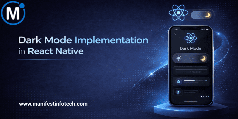
Dark mode has become a standard expectation in modern mobile apps. It reduces eye strain, saves battery on OLED devices, and offers a sleek aesthetic that many users prefer. With React Native, implementing dark mode is surprisingly simple—and incredibly flexible. Whether you\’re building a new app or upgrading an existing one, this step-by-step guide will help you add dark mode the right way.
𝟭. 𝗪𝗵𝘆 𝗗𝗮𝗿𝗸 𝗠𝗼𝗱𝗲 𝗠𝗮𝘁𝘁𝗲𝗿𝘀
Dark mode isn’t just a visual theme—it\’s part of user comfort and personalization. Benefits include:
- Better readability in low light
- Lower battery usage on OLED screens
- A premium, modern look
- Increased user engagement
Adding dark mode instantly enhances your app’s usability and appeal.
𝟮. 𝗗𝗲𝘁𝗲𝗰𝘁𝗶𝗻𝗴 𝗦𝘆𝘀𝘁𝗲𝗺 𝗧𝗵𝗲𝗺𝗲 𝘄𝗶𝘁𝗵 𝗔𝗽𝗽𝗲𝗮𝗿𝗮𝗻𝗰𝗲 𝗔𝗣𝗜
React Native provides the Appearance API to detect system-wide dark or light mode.
import { Appearance } from \'react-native\';

const colorScheme = Appearance.getColorScheme();
You’ll get \"light\" or \"dark\" based on the device settings.
To listen for changes:
Appearance.addChangeListener(({ colorScheme }) => {
  // update your theme here
});
This ensures your app responds instantly when users toggle their system theme.
𝟯. 𝗨𝘀𝗶𝗻𝗴 𝘂𝘀𝗲𝗖𝗼𝗹𝗼𝗿𝗦𝗰𝗵𝗲𝗺𝗲 𝗛𝗼𝗼𝗸 (𝗥𝗲𝗰𝗼𝗺𝗺𝗲𝗻𝗱𝗲𝗱)
React Native also includes a simple hook:
import { useColorScheme } from \'react-native\';
const theme = useColorScheme();  // \'light\' or \'dark\'
This hook is more convenient and updates automatically.
𝟰. 𝗦𝗲𝘁𝘁𝗶𝗻𝗴 𝗨𝗽 𝗧𝗵𝗲𝗺𝗲 𝗢𝗯𝗷𝗲𝗰𝘁𝘀
Create theme files to keep your design clean:
𝗹𝗶𝗴𝗵𝘁𝗧𝗵𝗲𝗺𝗲.𝗷𝘀
export default {
  background: \'#FFFFFF\',
  text: \'#111827\',
  card: \'#F3F4F6\',
};
𝗱𝗮𝗿𝗸𝗧𝗵𝗲𝗺𝗲.𝗷𝘀
export default {
  background: \'#000000\',
  text: \'#F9FAFB\',
  card: \'#1F2937\',
};
This gives you a scalable system when your app grows.
𝟱. 𝗔𝗽𝗽𝗹𝘆𝗶𝗻𝗴 𝗧𝗵𝗲𝗺𝗲𝘀 𝘄𝗶𝘁𝗵 𝗖𝗼𝗻𝘁𝗲𝘅𝘁 𝗼𝗿 𝗟𝗶𝗯𝗿𝗮𝗿𝗶𝗲𝘀
Use React Context to manage theme across the app:
const ThemeContext = createContext();
Wrap your app:
<ThemeContext.Provider value={theme === \'dark\' ? darkTheme : lightTheme}>
  <App />
</ThemeContext.Provider>
Then consume it:
const colors = useContext(ThemeContext);

<View style={{ backgroundColor: colors.background }}>
  <Text style={{ color: colors.text }}>Hello Dark Mode!</Text>
</View>
Your whole UI now switches dynamically.
𝟲. 𝗨𝘀𝗶𝗻𝗴 𝗧𝗵𝗶𝗿𝗱-𝗣𝗮𝗿𝘁𝘆 𝗟𝗶𝗯𝗿𝗮𝗿𝗶𝗲𝘀 (𝗢𝗽𝘁𝗶𝗼𝗻𝗮𝗹)
If you want even more structure:
- 𝗿𝗲𝗮𝗰𝘁-𝗻𝗮𝘁𝗶𝘃𝗲-𝗽𝗮𝗽𝗲𝗿 (built-in theming)
- 𝘀𝘁𝘆𝗹𝗲𝗱-𝗰𝗼𝗺𝗽𝗼𝗻𝗲𝗻𝘁𝘀 with theming
- 𝗿𝗲𝗮𝗰𝘁-𝗻𝗮𝘃𝗶𝗴𝗮𝘁𝗶𝗼𝗻 theme support
These libraries provide deeper control, especially for large-scale apps.
𝟳. 𝗔𝗱𝗱𝗶𝗻𝗴 𝗮 𝗠𝗮𝗻𝘂𝗮𝗹 𝗧𝗼𝗴𝗴𝗹𝗲
Some users want to override system settings. Add a switch in your settings screen:
const [isDark, setIsDark] = useState(false);
Use a toggle:
<Switch value={isDark} onValueChange={() => setIsDark(!isDark)} />
Store preference in AsyncStorage so it persists.
𝟴. 𝗧𝗲𝘀𝘁𝗶𝗻𝗴 𝗔𝗰𝗿𝗼𝘀𝘀 𝗗𝗲𝘃𝗶𝗰𝗲𝘀
Check dark mode on:
- Android devices (various versions)
- iOS devices (notch + non-notch)
- Tablets
- Simulators with different brightness
This ensures consistent visuals everywhere.
𝗙𝗶𝗻𝗮𝗹 𝗧𝗵𝗼𝘂𝗴𝗵𝘁𝘀
Implementing dark mode in React Native brings an immediate upgrade to your user experience. With built-in hooks, flexible theming, and smooth system integration, you can deliver a polished dark mode without heavy effort. Whether you keep it simple or build a full theme system, your users will appreciate the extra care.
If you are looking for any services related to Website Development, App Development, Digital Marketing and SEO, just email us at nchouksey@manifestinfotech.com
#ReactNative #DarkMode #MobileDevelopment #JavaScript #ReactNativeUI #UIUXDesign #DarkTheme #AppDesign #FrontendDevelopment #Theming #CrossPlatformDevelopment #ReactNativeTips #MobileAppDesign #ModernApps #DeveloperTips #StyledComponents #MobileUX #CodingBestPractices #TechDevelopment #DarkModeGuide