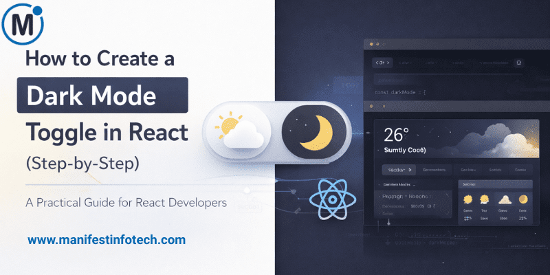
Dark mode has become a must-have feature in modern web applications. It enhances accessibility, reduces eye strain, and improves overall user experience. In this step-by-step guide, you’ll learn how to implement a clean and reusable dark mode toggle in React using best practices.
𝟭. 𝗦𝗲𝘁 𝗨𝗽 𝗮 𝗡𝗲𝘄 𝗥𝗲𝗮𝗰𝘁 𝗣𝗿𝗼𝗷𝗲𝗰𝘁
If you don’t already have a project:
npx create-react-app dark-mode-toggle
cd dark-mode-toggle
This gives you a fresh React environment to work with.
𝟮. 𝗖𝗿𝗲𝗮𝘁𝗲 𝗮 𝗧𝗵𝗲𝗺𝗲 𝗦𝘁𝗮𝘁𝗲 𝗨𝘀𝗶𝗻𝗴 𝘂𝘀𝗲𝗦𝘁𝗮𝘁𝗲
Inside your main component (e.g., App.js), create a theme state to store light or dark mode:
const [theme, setTheme] = useState(\"light\");

const toggleTheme = () => {
  setTheme((prev) => (prev === \"light\" ? \"dark\" : \"light\"));
};
This simple toggle function flips between themes on button click.
𝟯. 𝗔𝗽𝗽𝗹𝘆 𝗧𝗵𝗲𝗺𝗲 𝗖𝗹𝗮𝘀𝘀 𝘁𝗼 𝘁𝗵𝗲 𝗥𝗼𝗼𝘁 𝗘𝗹𝗲𝗺𝗲𝗻𝘁
We want the entire UI to change colors, so apply the theme class to a wrapper:
<div className={`app ${theme}`}>
  <button onClick={toggleTheme}>Toggle Dark Mode</button>
</div>
Now your styles will adapt based on the active theme class.
𝟰. 𝗔𝗱𝗱 𝗟𝗶𝗴𝗵𝘁 & 𝗗𝗮𝗿𝗸 𝗠𝗼𝗱𝗲 𝗦𝘁𝘆𝗹𝗲𝘀
In App.css:
.app.light {
  background: #ffffff;
  color: #000000;
}

.app.dark {
  background: #121212;
  color: #ffffff;
}

button {
  padding: 12px 18px;
  cursor: pointer;
}
This ensures clean visual transitions.
𝟱. (𝗢𝗽𝘁𝗶𝗼𝗻𝗮𝗹) 𝗦𝗮𝘃𝗲 𝗧𝗵𝗲𝗺𝗲 𝗣𝗿𝗲𝗳𝗲𝗿𝗲𝗻𝗰𝗲 𝗶𝗻 𝗟𝗼𝗰𝗮𝗹 𝗦𝘁𝗼𝗿𝗮𝗴𝗲
To remember user preference:
useEffect(() => {
  localStorage.setItem(\"theme\", theme);
}, [theme]);

useEffect(() => {
  const saved = localStorage.getItem(\"theme\");
  if (saved) setTheme(saved);
}, []);
𝗙𝗶𝗻𝗮𝗹 𝗧𝗵𝗼𝘂𝗴𝗵𝘁𝘀
Creating a dark mode toggle in React is simple yet powerful. With just a few lines of code, you can improve user comfort and give your application a modern, polished feel. You can extend this setup with animations, theme context providers, or CSS variables for more advanced theming.
If you are looking for any services related to Website Development, App Development, Digital Marketing and SEO, just email us at nchouksey@manifestinfotech.com
#DarkModeReact #ReactDarkMode #ReactTutorial #ReactJS #ReactDevelopment #FrontendDevelopment #WebDevelopment #DarkModeToggle #JavaScriptTutorial #ModernWebDev #ReactGuide #UIDesign #UXDesign #CodingTips #ReactDevCommunity #LearnReact #ReactBeginners #ReactSteps #TechGuide #ProgrammingTips