In recent years, the rise of dark mode has transformed the digital landscape, offering users an alternative interface that goes beyond aesthetics. From reducing eye strain to conserving battery life on mobile devices, dark mode design has become more than just a trendy feature—it\’s a functional enhancement that significantly impacts user experience and accessibility.
𝐄𝐦𝐛𝐫𝐚𝐜𝐢𝐧𝐠 𝐃𝐚𝐫𝐤 𝐌𝐨𝐝𝐞: 𝐀 𝐒𝐡𝐢𝐟𝐭 𝐢𝐧 𝐃𝐞𝐬𝐢𝐠𝐧 𝐏𝐚𝐫𝐚𝐝𝐢𝐠𝐦
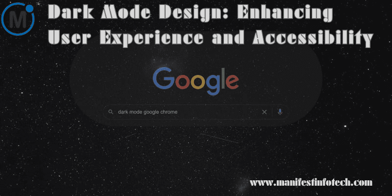
𝐓𝐡𝐞 𝐄𝐯𝐨𝐥𝐮𝐭𝐢𝐨𝐧 𝐨𝐟 𝐃𝐚𝐫𝐤 𝐌𝐨𝐝𝐞: Dark mode, initially perceived as a design preference for night owls or tech enthusiasts, has evolved into a mainstream feature across various digital platforms. Its appeal goes beyond personal taste, driven by the desire for increased comfort during extended screen time and a more modern, sleek appearance.
𝐀𝐝𝐝𝐫𝐞𝐬𝐬𝐢𝐧𝐠 𝐄𝐲𝐞 𝐒𝐭𝐫𝐚𝐢𝐧: One of the primary reasons users opt for dark mode is its ability to reduce eye strain, especially in low-light environments. By minimizing the contrast between the screen and surrounding ambient light, dark mode mitigates eye fatigue and enhances readability for many individuals.
𝐁𝐚𝐭𝐭𝐞𝐫𝐲 𝐋𝐢𝐟𝐞 𝐂𝐨𝐧𝐬𝐞𝐫𝐯𝐚𝐭𝐢𝐨𝐧: Mobile device users particularly benefit from dark mode as it can extend battery life, especially on devices with OLED or AMOLED screens. These displays utilize less power to illuminate darker pixels, resulting in lower energy consumption compared to bright, white interfaces.
𝐓𝐡𝐞 𝐅𝐮𝐧𝐜𝐭𝐢𝐨𝐧𝐚𝐥 𝐀𝐝𝐯𝐚𝐧𝐭𝐚𝐠𝐞𝐬 𝐨𝐟 𝐃𝐚𝐫𝐤 𝐌𝐨𝐝𝐞
𝐀𝐜𝐜𝐞𝐬𝐬𝐢𝐛𝐢𝐥𝐢𝐭𝐲 𝐂𝐨𝐧𝐬𝐢𝐝𝐞𝐫𝐚𝐭𝐢𝐨𝐧𝐬: Dark mode significantly contributes to enhancing accessibility for users with visual impairments or sensitivity to bright light. For individuals with conditions like photophobia or certain types of visual impairments, dark mode can offer a more comfortable browsing experience.
𝐑𝐞𝐚𝐝𝐚𝐛𝐢𝐥𝐢𝐭𝐲 𝐚𝐧𝐝 𝐅𝐨𝐜𝐮𝐬: Contrary to the belief that dark mode is solely for aesthetics, it can actually improve readability and focus by reducing screen glare and distractions. Text and content stand out more prominently against a dark background, fostering better attention to detail.
𝐃𝐞𝐬𝐢𝐠𝐧𝐢𝐧𝐠 𝐟𝐨𝐫 𝐃𝐚𝐫𝐤 𝐌𝐨𝐝𝐞: 𝐁𝐞𝐬𝐭 𝐏𝐫𝐚𝐜𝐭𝐢𝐜𝐞𝐬
Implementing dark mode effectively requires careful consideration and implementation:
– 𝐂𝐨𝐥𝐨𝐫 𝐏𝐚𝐥𝐞𝐭𝐭𝐞 𝐒𝐞𝐥𝐞𝐜𝐭𝐢𝐨𝐧: Utilize contrasting colors that maintain readability and visual hierarchy in dark mode.
– 𝐂𝐨𝐧𝐬𝐢𝐬𝐭𝐞𝐧𝐜𝐲 𝐚𝐜𝐫𝐨𝐬𝐬 𝐏𝐥𝐚𝐭𝐟𝐨𝐫𝐦𝐬: Ensure a consistent dark mode experience across various devices and operating systems.
– 𝐔𝐬𝐞𝐫 𝐏𝐫𝐞𝐟𝐞𝐫𝐞𝐧𝐜𝐞 𝐒𝐞𝐭𝐭𝐢𝐧𝐠𝐬: Provide users with the option to toggle between dark and light modes based on their preferences.
𝐓𝐡𝐞 𝐅𝐮𝐭𝐮𝐫𝐞 𝐨𝐟 𝐃𝐚𝐫𝐤 𝐌𝐨𝐝𝐞 𝐢𝐧 𝐃𝐞𝐬𝐢𝐠𝐧: As the adoption of dark mode continues to grow, its integration into various digital interfaces will become more nuanced and sophisticated. Designers and developers will explore innovative ways to optimize dark mode for different contexts while emphasizing accessibility and usability.
If you are looking for any services related to Website Development, App Development, Digital Marketing and SEO, just email us at nchouksey@manifestinfotech.com or Skype id: live:76bad32bff24d30d
𝐅𝐨𝐥𝐥𝐨𝐰 𝐔𝐬:
𝐋𝐢𝐧𝐤𝐞𝐝𝐢𝐧: linkedin.com/company/manifestinfotech
𝐅𝐚𝐜𝐞𝐛𝐨𝐨𝐤: facebook.com/manifestinfotech/
𝐈𝐧𝐬𝐭𝐚𝐠𝐫𝐚𝐦: instagram.com/manifestinfotech/
𝐓𝐰𝐢𝐭𝐭𝐞𝐫: twitter.com/Manifest_info
#DarkModeDesign #UXDesign #AccessibilityMatters #InclusiveDesign #UserExperience #DigitalAccessibility #EyeStrainRelief #Readability #DesignTrends #VisualComfort #AccessibleTech #ModernDesign #DigitalInclusion #TechTrends #UserInterface #MobileUX #DarkModeBenefits #DesignThinking #TechInnovation #VisualDesign