Making a website responsive is crucial to ensure that it looks and functions well on various devices and screen sizes, including desktops, tablets, and smartphones. Here\’s a general guideline to help you make your website responsive:
𝟏. 𝐔𝐬𝐞 𝐚 𝐌𝐨𝐛𝐢𝐥𝐞-𝐅𝐢𝐫𝐬𝐭 𝐀𝐩𝐩𝐫𝐨𝐚𝐜𝐡:
Start designing your website with the mobile version in mind first, then progressively enhance it for larger screens. This approach helps ensure that your design works well on smaller devices.
𝟐. 𝐅𝐥𝐞𝐱𝐢𝐛𝐥𝐞 𝐋𝐚𝐲𝐨𝐮𝐭:
Use relative units like percentages (%) or ems for widths, margins, and padding instead of fixed units like pixels (px). This allows elements to adjust based on the screen size.
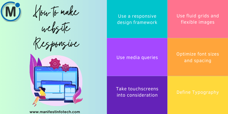
𝟑. 𝐌𝐞𝐝𝐢𝐚 𝐐𝐮𝐞𝐫𝐢𝐞𝐬:
Media queries are CSS rules that apply specific styles based on the screen width. They allow you to create different layouts for different devices.
𝟒. 𝐅𝐥𝐞𝐱𝐢𝐛𝐥𝐞 𝐈𝐦𝐚𝐠𝐞𝐬 𝐚𝐧𝐝 𝐌𝐞𝐝𝐢𝐚:
Use CSS properties like `max-width: 100%` for images and `embed`, `object`, and `iframe` elements to ensure they scale properly on different screens.
𝟓. 𝐕𝐢𝐞𝐰𝐩𝐨𝐫𝐭 𝐌𝐞𝐭𝐚 𝐓𝐚𝐠:
Add a viewport meta tag to your HTML to control how the website is displayed on different devices.
𝟔. 𝐆𝐫𝐢𝐝 𝐒𝐲𝐬𝐭𝐞𝐦𝐬 𝐚𝐧𝐝 𝐅𝐫𝐚𝐦𝐞𝐰𝐨𝐫𝐤𝐬:
Consider using CSS grid systems or responsive frameworks like Bootstrap or Foundation. These tools provide pre-built responsive components and grids that can speed up your development process.
𝟕. 𝐅𝐥𝐮𝐢𝐝 𝐓𝐲𝐩𝐨𝐠𝐫𝐚𝐩𝐡𝐲:
Use `vw` (viewport width) units for font sizes to make the text scale with the screen size.
𝟖. 𝐍𝐚𝐯𝐢𝐠𝐚𝐭𝐢𝐨𝐧:
Optimize your navigation for smaller screens. You might need to use a hamburger menu or prioritize certain menu items.
𝟗. 𝐓𝐞𝐬𝐭𝐢𝐧𝐠:
Regularly test your website on various devices and browsers to ensure it functions as expected. Many modern web browsers have built-in tools for testing responsive designs.
𝟏𝟎. 𝐏𝐞𝐫𝐟𝐨𝐫𝐦𝐚𝐧𝐜𝐞:
Keep performance in mind. Optimize images, minimize CSS and JavaScript, and use lazy loading techniques to improve page load times.
𝟏𝟏. 𝐔𝐬𝐞𝐫 𝐄𝐱𝐩𝐞𝐫𝐢𝐞𝐧𝐜𝐞 (𝐔𝐗):
Pay attention to the overall user experience. Ensure that buttons, links, and interactive elements are easy to tap on touchscreens, and that the content is readable without excessive zooming.
𝟏𝟐. 𝐏𝐫𝐨𝐠𝐫𝐞𝐬𝐬𝐢𝐯𝐞 𝐄𝐧𝐡𝐚𝐧𝐜𝐞𝐦𝐞𝐧𝐭:
Start with the core content and functionality that works on all devices, then add enhancements for larger screens. This ensures a basic usable experience on all devices.
Remember that responsiveness is an ongoing process. As new devices and screen sizes emerge, you may need to make adjustments to your design to ensure it remains user-friendly and functional.
If you are looking for any services related to Website Development, App Development, Digital Marketing and SEO, just email us at nchouksey@manifestinfotech.com or Skype id: live:76bad32bff24d30d
𝐅𝐨𝐥𝐥𝐨𝐰 𝐔𝐬:
𝐋𝐢𝐧𝐤𝐞𝐝𝐢𝐧: linkedin.com/company/manifestinfotech
𝐅𝐚𝐜𝐞𝐛𝐨𝐨𝐤: facebook.com/manifestinfotech/
𝐈𝐧𝐬𝐭𝐚𝐠𝐫𝐚𝐦: instagram.com/manifestinfotech/
𝐓𝐰𝐢𝐭𝐭𝐞𝐫: twitter.com/Manifest_info
#WebsiteOptimization #AdaptiveWeb #DesignForAllDevices #MobileFirst #ResponsiveCoding #CrossPlatformDesign #UIResponsive #UXDesign #ResponsiveUI #WebResponsiveness #DeviceCompatibility #ResponsiveFramework #MediaQueries #FluidLayout #ResponsiveImages #CSSGrid #ViewportDesign #ResponsiveTesting #ResponsiveNavigation #MobileOptimization #FlexibleDesign #ScreenSizeAdaptation #ResponsivePerformance #ResponsiveTips #MultiDeviceDesign #BrowserCompatibility